
About The Project: For this in-class project, I had to create a poster focusing on the design aspect of typeface. The typeface that I chose to use for this project was Baskerville. I had to carefully design a poster while keeping five major design principles in mind. These major principles were font size, font weight, color, spacing and direction. The tweaking of these major points was undertaken in order to make the typeface the focal point of the poster, drawing the viewer’s attention and eyes to the Baskerville focal point. One unique thing about this project is that we were limited to using only the colors black and white. But we could alter the tint of black to give us different shades of grey. With these guidelines in mind, it offered a challenge.
Goal: The original for this assignment was to design three prototypes of a poster that focused on the specific typeface that we wanted to work with. Each prototype needed to showcase the typeface and a small paragraph about it. All three prototypes were completely different because each poster had a different focal point on which focus.
These three focal points were:
1. Focal Point: Name of the typeface
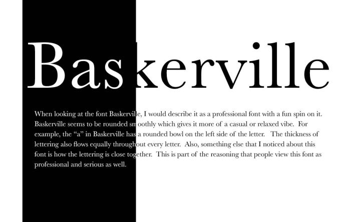 This poster focused on the name of the typeface Baskerville.
In terms of my stylistic choices, my text is somewhat aligned in the center while transitioning from white to black. This is because there is a black rectangle on the left side of the page. This ultimately causes this white to black text transition.
2. Focal Point: Glyph or two
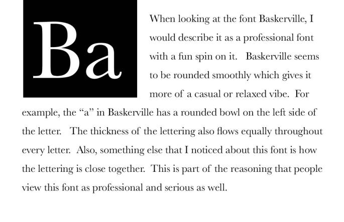 For this prototype I focused on the two glyphs, “Ba” which are the first two letters in the typeface Baskerville.
The glyphs are in the top left corner in a black box. The glyphs are white so they are clearly visible to the audience. When creating this poster, I was aiming to make the glyphs look like a periodic table symbol. After this I then filled the rest of the page with black text.
3. Focal Point: Anything
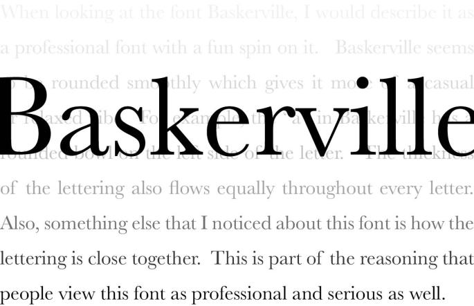 This poster aimed at having the name of the typeface be the focal point but also included a unique background.
The word, Baskerville, is stretched across the screen placed close to the center. Then there is the text filling the entire background which is slowly fading from light to dark. This background acts as a different focal point for the viewer instead of thinking of the obvious one.
My Pick: The prototype that I decided that had the most potential is the one with the typeface as the focal point. This is because it has a unique and dramatic color contrast by altering the color from black to white in terms of the focal point and the text.
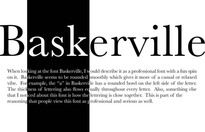
Adjustments Made For Final: Adjustments that took place in the process of finalizing my final poster were expanding the focal point to fit more of the screen. Now the word, “Baskerville” is covering the whole length of the screen horizontally. Another change that I made was making the typeface and text go from black to white to black. In my previous version of this poster it only went from white to black. Now that I expanded this type, it allows for me to alter the colors twice which makes it more eye catching and intriguing.
In addition to the dramatic effect of the white to black and then back to white as the viewer’s eyes read the word, I had to decide where to change the color band within the work and also had to decide how wide it would be. I decided to have it change on the letters, “ask” within Baskerville as “ask” is a word by itself. My thinking was that it will further draw a person’s eyes to the black as they process the word and it almost makes the viewer pause a little more as they see the word “ask” within the word Baskerville. In this way the viewer is hit with a double change as they read the word Baskerville. First the white changes to black but at the same time there is the word “ask” that they must process. This increases the change and almost makes the viewer pause just a little more as they see and understand the word “ask”. In this way I was hoping to increase the effect and even how long the viewer looks at the word. It is almost like a reader is startled and wonders why the word “ask” is there. In this way I feel I capture the viewer attention for just a millisecond more than if I had had the color change at another part in the word.
Challenge: One main challenge that I experienced was making sure that everything on the poster was aligned perfectly. Aligning text just the way you want it can be a struggle at times and was a common problem that I encountered. Another challenge that I experienced was when I had to adjust the type in the body text from black to white to make it align perfectly.
Experience: Even though it seems like a basic project, it was harder than I thought it would be because there was a lot of adjusting and tweaking that had to be made to the posters.
I expected the project to come out clean and professional but also be a poster that people want to look at.
Stylistic strategies I used:
- Rule of thirds
- Text size
- Color contrast
- Alignment
- Color adjustment
- Spacing
Final Product: As mentioned before, for my final poster I decided to go with one with the typeface as the focal point.
My final product focused on the name of the typeface, “Baskerville” as the focal point while playing around with the color contrast of black and white.
With adjustments made through the process, my final product turned out to be just the way I wanted it. It is very simplistic and has a perfect contrast of black and white to balance the poster. It is very eye-catching and provoking to a viewer who is looking at it.
