Personality: How it Affects Graphic Designers

When reading the article, “What Type of Graphic Designer Are You,” it made me wonder what type of graphic designer I am.  Being a very broad question, it made me really think about how I would describe myself as a designer and what I want to do in the future.  After reading through the article, I would classify myself as, “The Visual Sellers of Advertisements.” This is because these types of graphic designers focus on variation and are continuously working on new projects.  When I took the personality test, I ended up with the letters of ENFP. These letters stand for extraversion, intuition, feeling and perception. These letters stand for someone who has a campaigner personality. Campaigners are very curious people when it comes to life in general or new project ideas in a workplace.  

After going through the reading and the personality test, I learned that my personality type somewhat correlates with what type of graphic design work I want to do.  Campaigners are super-curious people and are always excited about the new things in life. This personality type relates to the graphic designer, “The Visual Sellers of Advertisements,” because they both focus on variation and look forward to new things that are happening.  Someone who has a campaigner personality type could definitely fit right in to a graphic design job that does work on the visual aspect of advertisements due to constant new projects and materials.

After taking this test, some of the positive characters that a “campaigner” has to offer are: being curious, observant, energetic, friendly, excellent communicator, and knowing how to relax.  Many of these positive characteristics could benefit me as a graphic designer when it comes to a work environment. For my chosen career in the beginning, it would be ideal to work within a creative team to get my foot in the door.  Being curious is important when working with a team because it helps bounce around ideas. Curiosity can lead to possible new ideas for projects. Also, being energetic, friendly and an excellent communicator is crucial when working with a team.  You need to be friendly when working for a team so your fellow employees get along and respect you as a colleague. Being energetic is key to keeping positive vibes during the work day and also so people listen to you.

For a team, communication is probably the most important quality because it relays information from person to person in order to make sure everything is nicely organized.  Without communication a company would be hopeless since there would be no direction given. With excellent communication skills, it will be easy to work within a creative team as I can communicate with them in a  straightforward manner.

A challenge that I could encounter as a graphic designer would be jumping from task to task, as one of my weaknesses from the personality test is finding it difficult to focus.  The trait represents me well because I tend to jump from topic to topic all the time. When working for a creative team, it could be challenging to stick to the project at hand, when there are multiple projects floating around at the same time.  To address this weakness, it would be difficult to focus in an active environment with people talking back and forth. In order to solve this, I could only focus on the task at hand. If the environment seems to be too active, one solution would be to put headphones on and listen to music. 

Another problem that could arise as a graphic designer, based on my personality test, is not being able to finalize a project. This could be a problem because one weakness that caught my eye based on my personality test is overthinking things. This characteristic can be horrible as a designer because overthinking things can cause hours of extra work.  Not being able to finalize a project because it doesn’t look right can all be due to the process of overthinking. In order to address the challenge of overthinking things, it would be ideal to get the opinions of other colleagues in order to get the most opinions possible. Overall, personality affects how a graphic designer works due to the strengths and weaknesses that each person has.

Drop Cap: Easy Directions to Make

For this assignment we were tasked to create a drop cap that focuses on the first letter in our first or last name.  I decided to go with the letter “L” for this assignment as it represents my last name “Lewis”.  With limited time, 10 minutes to be exact, I decided to create my drop cap using the pen tool.  I chose this instrument because the pen tool is straightforward and offers a lot of creativity.  While using these tools, I created an “L” shape with sharp pointed corners and small rectangles shooting behind.  After creating this logo we had to create clear instructions on how to create the logo.  In these instructions it was crucial for them to be easy to follow and specific as others would be trying to follow them.  It was very difficult to write these instructions about specific directions that must be done within the program that I was using, Adobe Illustrator.

 Directions are below:

caphead

  1. Open up the program Adobe Illustrator.
  2. Create a standard illustrator document (8.5 x 11 inches) under the “Print” section.
  3. Select your pen tool located in the top of your toolbar.
  4. Make sure that the color black is selected before you start drawing.
  5. With the pen tool, draw a skinny rectangle while making one of the corners pointed.  One of the small sides should have a point in the corner and look like the side of a trapezoid (320 degrees angle).
  6. Rotate the skinny rectangle to where the pointed corner is the top-left corner of the letter “L”.
  7. This skinny rectangle will act as one of the sides for the letter “L”.
  8. Create another skinny rectangle and repeat the process, but the pointed corner should now be in the bottom-right corner of the “L”.
  9. Combine these two rectangles to form an “L”-like shape.
  10. Once the “L” is complete, create a 10 (width) x 2 (length) inch black rectangle.
  11. Duplicate this box 12 times to create a total of 13 small black rectangles (hold option and drag object to duplicate).
  12. With these rectangles, place them along the bottom half of the latitudinal side of the “L”.
  13. Each small rectangle should have a bit of white space in-between to look as if someone is firing bullets.
  14. After your small rectangles are placed the way you want them, make sure your image is centered and is visible on the page.
  15. Save your image!

Baskerville Project Case Study

About The Project: For this in-class project, I had to create a poster focusing on the design aspect of typeface.  The typeface that I chose to use for this project was Baskerville. I had to carefully design a poster while keeping five major design principles in mind. These major principles were font size, font weight, color, spacing and direction.  The tweaking of these major points was undertaken in order to make the typeface the focal point of the poster, drawing the viewer’s attention and eyes to the Baskerville focal point. One unique thing about this project is that we were limited to using only the colors black and white.  But we could alter the tint of black to give us different shades of grey. With these guidelines in mind, it offered a challenge.

Goal: The original for this assignment was to design three prototypes of a poster that focused on the specific typeface that we wanted to work with.  Each prototype needed to showcase the typeface and a small paragraph about it. All three prototypes were completely different because each poster had a different focal point on which focus.

These three focal points were:

1. Focal Point: Name of the typeface

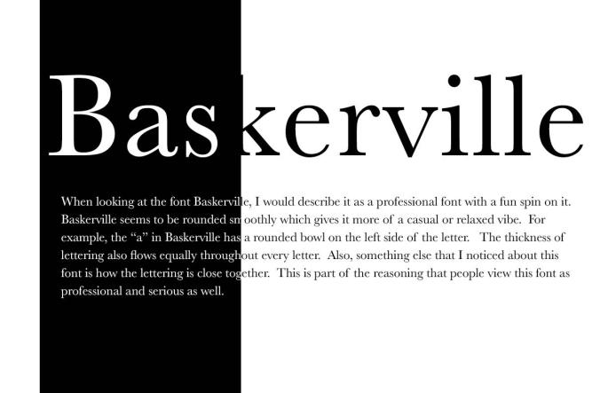
baskervilleprototypes                            This poster focused on the name of the typeface Baskerville.

In terms of my stylistic choices, my text is somewhat aligned in the center while transitioning from white to black.  This is because there is a black rectangle on the left side of the page. This ultimately causes this white to black text transition.

2. Focal Point: Glyph or two

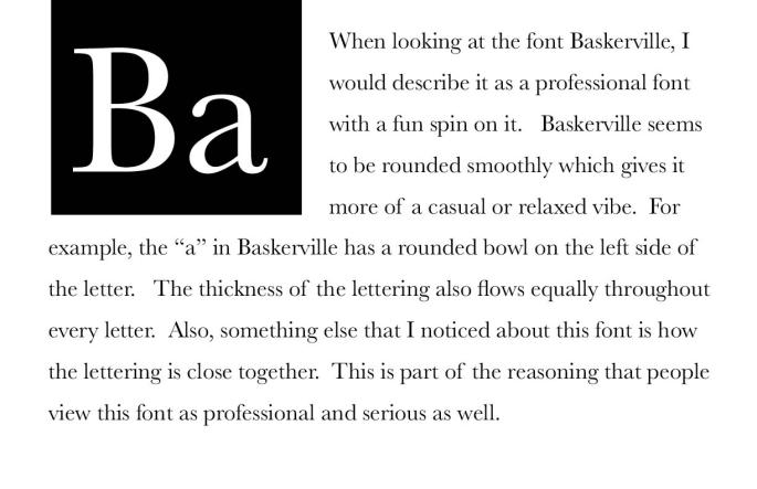
baskervilleprototypes2.jpg          For this prototype I focused on the two glyphs, “Ba” which are the first two                              letters in the typeface Baskerville.

The glyphs are in the top left corner in a black box.  The glyphs are white so they are clearly visible to the audience.  When creating this poster, I was aiming to make the glyphs look like a periodic table symbol.  After this I then filled the rest of the page with black text.

3. Focal Point: Anything


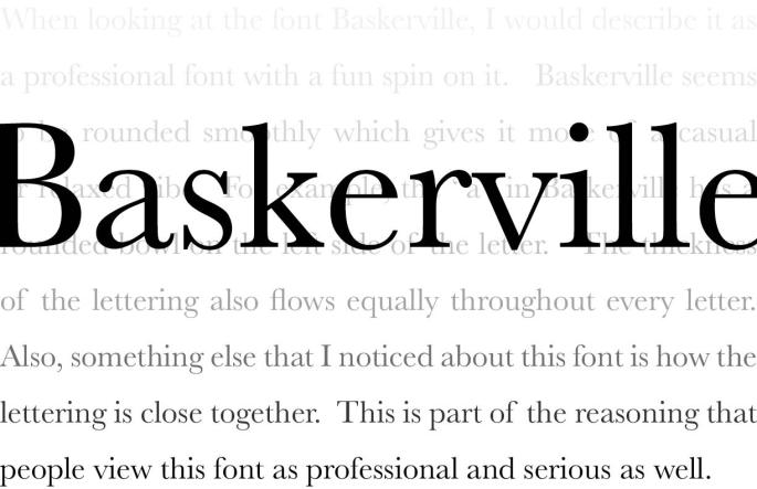
baskervilleprototypes3.jpgThis poster aimed at having the name of the typeface be the focal point but also included a unique background.

The word, Baskerville, is stretched across the screen placed close to the center.  Then there is the text filling the entire background which is slowly fading from light to dark.  This background acts as a different focal point for the viewer instead of thinking of the obvious one.

My Pick: The prototype that I decided that had the most potential is the one with the typeface as the focal point.  This is because it has a unique and dramatic color contrast by altering the color from black to white in terms of the focal point and the text.

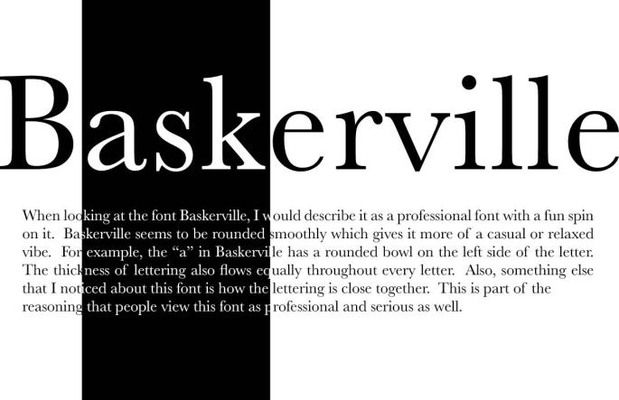
Adjustments Made For Final: Adjustments that took place in the process of finalizing my final poster were expanding the focal point to fit more of the screen.  Now the word, “Baskerville” is covering the whole length of the screen horizontally. Another change that I made was making the typeface and text go from black to white to black.  In my previous version of this poster it only went from white to black. Now that I expanded this type, it allows for me to alter the colors twice which makes it more eye catching and intriguing.

In addition to the dramatic effect of the white to black and then back to white as the viewer’s eyes read the word, I had to decide where to change the color band within the work and also had to decide how wide it would be.  I decided to have it change on the letters, “ask” within Baskerville as “ask” is a word by itself. My thinking was that it will further draw a person’s eyes to the black as they process the word and it almost makes the viewer pause a little more as they see the word “ask” within the word Baskerville.  In this way the viewer is hit with a double change as they read the word Baskerville. First the white changes to black but at the same time there is the word “ask” that they must process. This increases the change and almost makes the viewer pause just a little more as they see and understand the word “ask”.  In this way I was hoping to increase the effect and even how long the viewer looks at the word. It is almost like a reader is startled and wonders why the word “ask” is there. In this way I feel I capture the viewer attention for just a millisecond more than if I had had the color change at another part in the word.

Challenge: One main challenge that I experienced was making sure that everything on the poster was aligned perfectly.  Aligning text just the way you want it can be a struggle at times and was a common problem that I encountered.  Another challenge that I experienced was when I had to adjust the type in the body text from black to white to make it align perfectly.

Experience: Even though it seems like a basic project, it was harder than I thought it would be because there was a lot of adjusting and tweaking that had to be made to the posters.

I expected the project to come out clean and professional but also be a poster that people want to look at.

Stylistic strategies I used:

  • Rule of thirds
  • Text size
  • Color contrast
  • Alignment
  • Color adjustment
  • Spacing

Final Product: As mentioned before, for my final poster I decided to go with one with the typeface as the focal point.

finalbaskerville

My final product focused on the name of the typeface, “Baskerville” as the focal point while playing around with the color contrast of black and white.  

With adjustments made through the process, my final product turned out to be just the way I wanted it.  It is very simplistic and has a perfect contrast of black and white to balance the poster.  It is very eye-catching and provoking to a viewer who is looking at it.

Baskerville: Typeface From History Used Today

One typeface that stood out to me is Baskerville due to the creative value that it offers.  When first looking at the font, the first word that comes to my mind is simplistic. This is because it seems like a typical font you would find in a news article.   The classification that the typeface, Baskerville, resides in is serif or more specifically transitional serif. This font seems basic, but when adjusting the weight, it seems to be more eye-catching to the viewer.  

The Baskerville font was designed in 1754 in Birmingham, England.  John Baskerville was a servant for a clergy who recognized his penmanship talents and helped support him to learn writing.  Baskerville worked on print technology and he worked to create a black ink color from boiling linseed oil (http://idsgn.org/).

Furthermore, this font seems to be used for many professional pieces.  Examples of this are spec sheets, news articles, magazines and websites. According to Fontslate.info, it is used “to add length and importance to a manuscript.”  Basically, it helps to use the font because of the amount of space it takes up. Some characters are widened and made more round and there is more of a contrast between the thick and thin strokes.  Some other professional pieces that you could use the font Baskerville with are: promotional signs, advertisements and flyers.

Even though this font is very professional, when looking at it, I would describe it as a professional font with a fun spin on it.  Baskerville is similar to many fonts out there, but it does have a couple distinguishing characteristics that separates the font from the rest.  One obvious different characteristic is the thickness of the lettering. The lettering is bulkier than other typefaces which makes it stand out more.  For example, the “B” in Baskerville has a wide thickness and seems very dense. Another thing that I noticed is that the spacing between each of the letters is tight and close together.  This eliminates most of the empty space between the lettering due to the type being tightly packed. Baskerville also seems to be rounded smoothly which gives it more of a casual or relaxed vibe.  For example, the “a” in Baskerville has a rounded bowl on the left side of the letter. The thickness of the lettering flows equally throughout every letter as you would see in any typical typeface.  Also, something else that I noticed about this font is how the lettering is close together. When saying this, I am talking about the default version of the font Baskerville. The tightness of lettering is a common pattern that I see when typing in Baskerville.  

This font appeals to me because you can use it an almost any situation.  It fits the style for professional documents and spec sheets, but also can be used in a fun magazine by adjusting the major principles.  Some of these principles include font weight, color and direction. These principles basically alter the visual representation of every single font.  They are useful to put a different spin and perspective on the font being used. Overall, this font seems to work all around due to it being used in multiple professional and casual scenarios.  Baskerville has been around for a while and does not look like it is going anywhere anytime soon.

Work Cited

Baskerville, J. (1970, January 01). Baskerville. Retrieved from http://fontslate.info/typefaces/baskerville.html

Yau, C. (2010, October 26). Idsgn (a design blog). Retrieved from http://idsgn.org/posts/know-your-type-baskerville/

Typography And Its Impact On People

Typography has an affect on experiences in general.  Type can affect the atmosphere and the mood. This is due to how the type is displayed to the viewer.  Typography is seen everywhere, and it is represented by many companies due to the clear message that it gives off.  All type should be clear, readable and straightforward. When creating type, experts take many factors into account.  Some of these factors include proportions, curves and measurements. All of the products that we eat or drink are represented through typography.  It has an impact on our everyday life since it is seen all over the place.

When reading type, the typography used affects how I view the message or word.  For example, typography plays a huge role in logo design. It can basically make or break a companies logo. Typography is usually the centerpiece for a logo so it is crucial that the designer picks the perfect font.  There are many different styles that designers use for different scenarios to allow the designer to give the message that he wants to give. These styles are created using many different tools but one important one is the grid tool.  This tool creates order and organization because it allows you to keep your typography aligned. We see typography everywhere we look. Each type tends to give off a different message. Typography has been adjusted and altered over the years as many different types have been created to fit all different scenarios.

Today, there are endless types of typography that give the designers the ability to choose whatever they want. One of the most popular forms of typography happens to be Helvetica.  Helvetica emerged in 1957. It became a “default” font that many designers used. This is due to the popularity of this typeface ever since it was created. This font was created by Eduard Hoffmann. Hoffman was basically trying to make a modernized version of a German San Serif font.  It was the most popular typeface used during the Vietnam and Iraq war. This font is so popular because it comes off as more accessible, transparent and accountable. Overall, typography has an enormous effect on how we view all of the experiences that we encounter in our life. Type has evolved tremendously due to the designers ability to create new content and the advancement in technology.